

Reviews
Gary Hustwit
USA, 2007
Credits
Review by Rumsey Taylor
Posted on 22 March 2007
Source 35mm print
Related articles
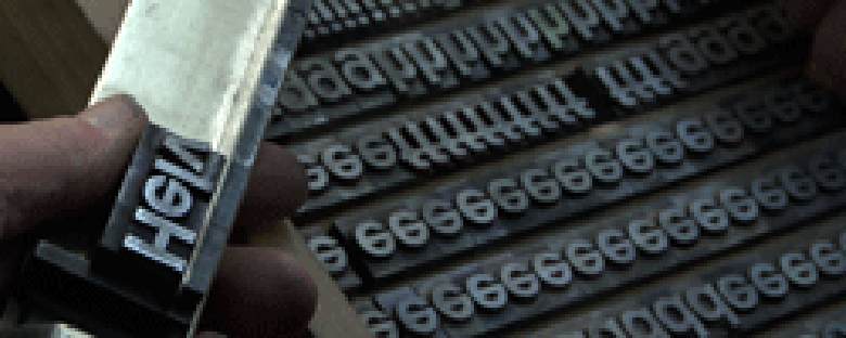
Helvetica is the most ubiquitous piece of graphic design in history, and as such has populated the world like a plague, either gracing or littering everything from Times Square to metropolitan transit directions to corporate identities to NASA spacecrafts to tax forms to this website. Designed in Switzerland in 1957 as an industry sans serif, it nourished the design community in such profusion that its very abundance has become the predominant contention against it. It is an icon of precision, or it is frustratingly familiar; it is perfectly subliminal, or it is the typeface of socialism.
Gary Hustwit’s film is replete with summary photography that finds Helvetica everywhere (and exiting this film into the open world, it is difficult not to continue the film’s scrutiny of urban signage). But Hustwit’s film remains austere and distant, concerned with articulating the arguments for and against Helvetica’s use via a series of interviews with internationally renowned typographers and designers. The film will neither endorse nor condemn these debates, but in its distance — retained in placid photography and an anonymous electronic score — it will reinforce the typeface’s idealism or familiarity, depending upon which camp you’re in. Helvetica is a touchstone that encourages many potent rants, among them David Carson, a self-taught graphic designer. He observes the word “caffeinated” set in bold, lowercase Helvetica in his studio: “Look at this!” he remarks excitedly, “This doesn’t say ‘caffeinated’!”
Helvetica remains so carefully ascetic it retains the very qualities of its subject: concise yet unexpressive, purposeful yet not caustic, utilitarian and unembellished. This is entirely appropriate in concept, and yet remains engaging, how something so two-dimensional and contestably uncinematic supplies the subject of a film. Appropriately, once the final credits roll, you’re likely to sit through them with an enhanced understanding of the typeface they’re in.
We don’t do comments anymore, but you may contact us here or find us on Twitter or Facebook.